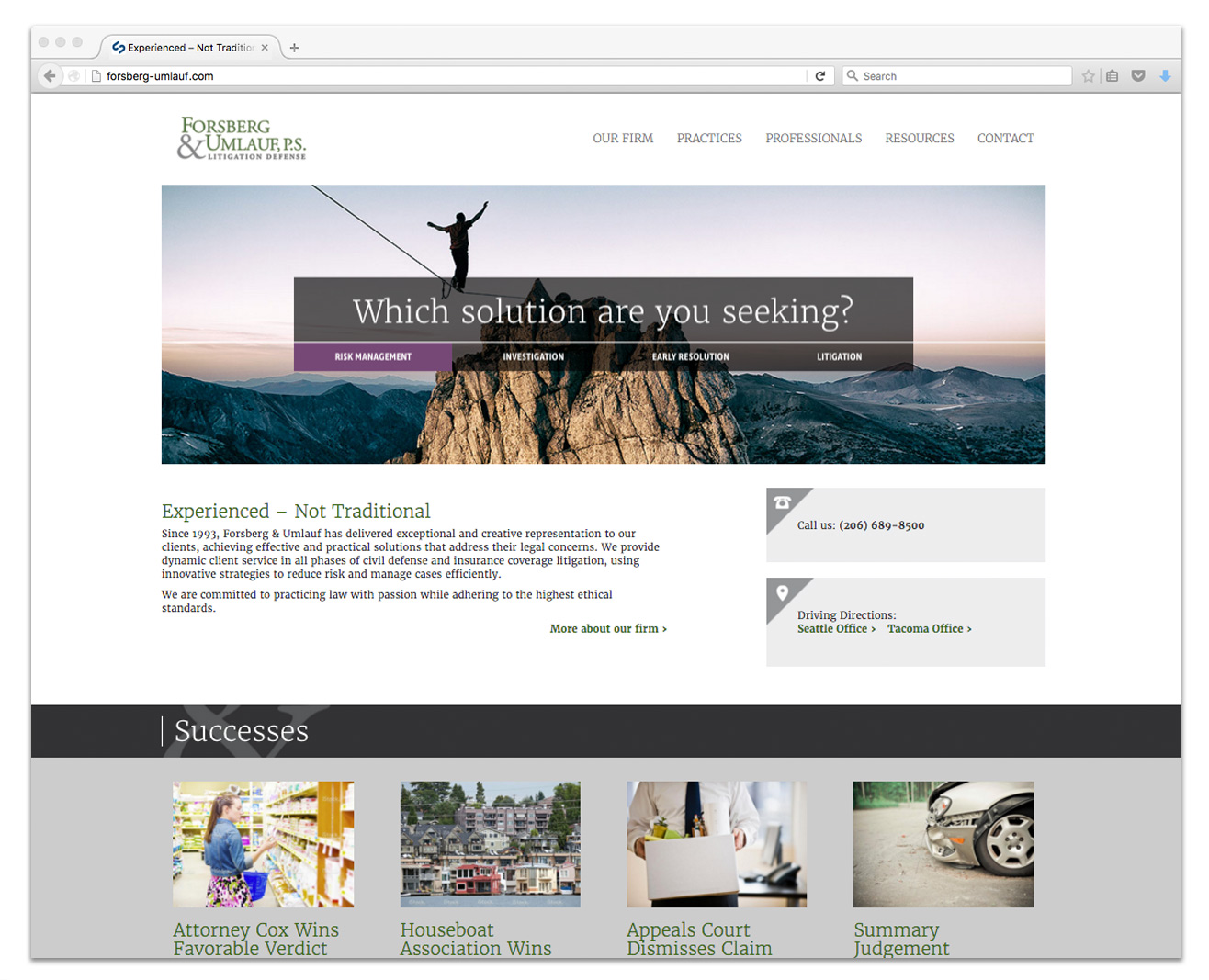
This prominent law firm had outgrown their old website and needed a refreshed design that better served mobile users and better represented them as leaders in their field. The design we came up with portrays them as “problem solvers” and partners to their clients.
Category: Uncategorized
The Origins of April Fools
It’s said that April Fool’s originated in the 1500s when France switched from the Julian calendar, in which the new year was celebrated on April 1, to the Gregorian calendar, which made January 1 the beginning of the new year. Anybody who continued to celebrate the new year on April 1st was branded an “April Fool”. Except in France they shout, “Poisson d’Avril!” which means, literally, “April Fish!” (“April fish” refers to a young fish, thus one easily caught.) Ok. In Scotland, where April 1 is devoted to spoofs involving the buttocks and who’s citizens are credited with inventing the classic “Kick Me!” sign, they refer to the pranked as an April “gowk”, the Scottish word for cuckoo.
NEW WORK: Rebranding and Website Design
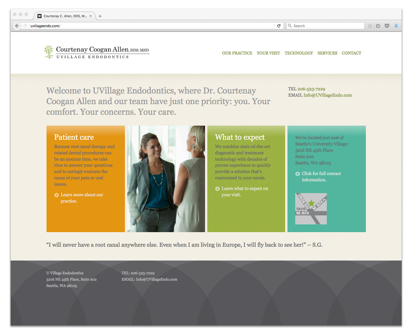
We created a new identity for UVillage Endodontics based on a tree that displays its roots (an endodontist does root canals) as a subtle reference to the nearby University Village shopping mall. We’re following that up with a responsive website that positions the practice as professional and caring.
A Year’s Worth of Inspiration for 2015
Maybe it’s just another day on the calendar but for most of us January 1st represents a ticket to 365 new days of possibility. Continue reading “A Year’s Worth of Inspiration for 2015”
Things to Consider When Planning a Website Redesign
Some good tips from FastCo on designing on a budget. When the Stanford Persuasive Technology Lab asked consumers how they evaluate a website’s credibility, nearly half said design was the number one criteria.
http://www.fastcodesign.com/3030645/7-tips-for-designing-on-a-budget
NEW WORK: Branding and Collateral Design for Web Application
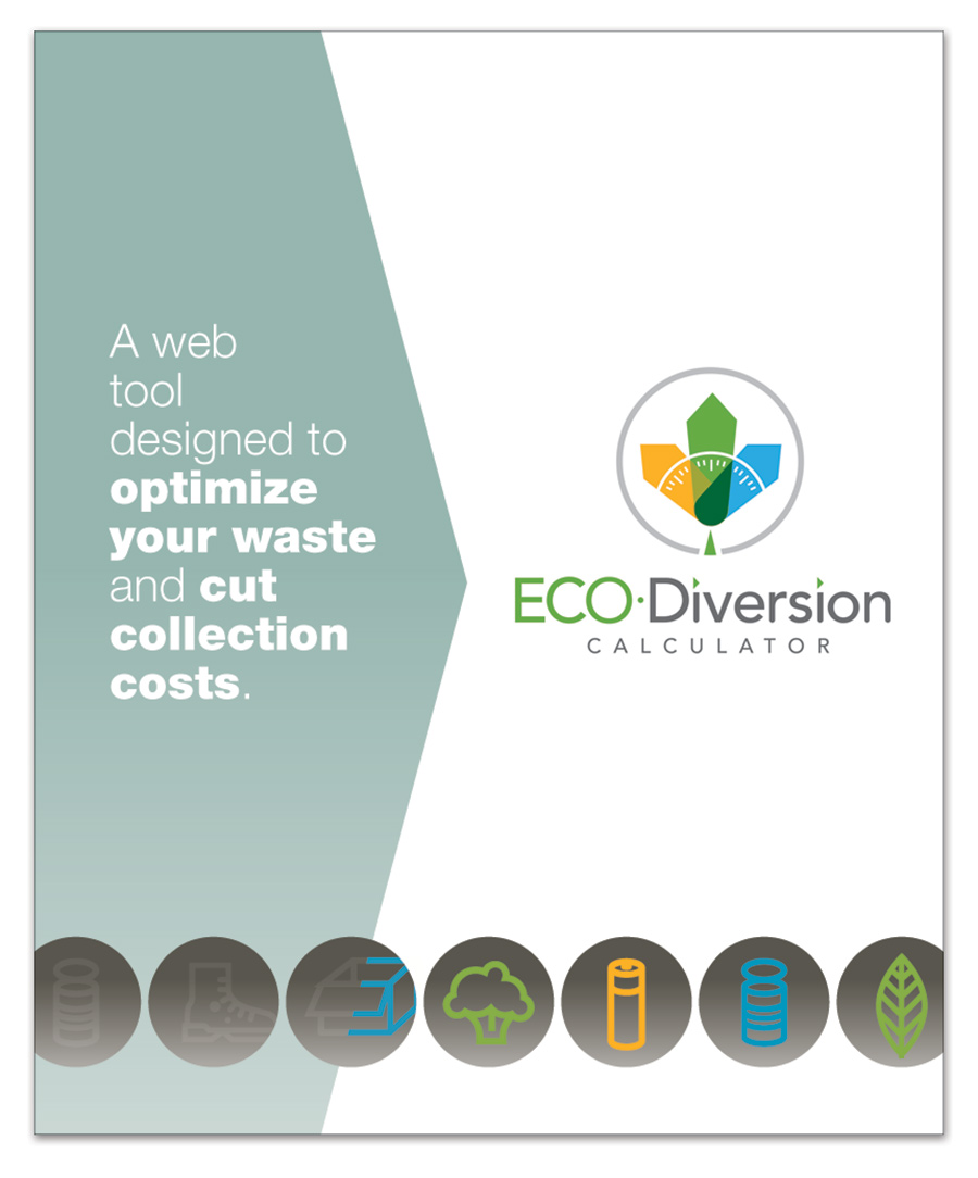
Cascadia Consulting asked Welsh&Co. to design a brand identity and brochure for their ECO Diversion Calculator, an online application that helps municipalities increase diversion and maximize the efficiency of their waste collection. The logo illustrates the idea with three diverging arrows, representing the waste stream being divided into its component parts: garbage, compostables and recycling. The brochure extolled the product’s benefits with icons and a minimum of copy.
Continue reading “NEW WORK: Branding and Collateral Design for Web Application”
NEW WORK: Joseph Kaftan Mosaics Website
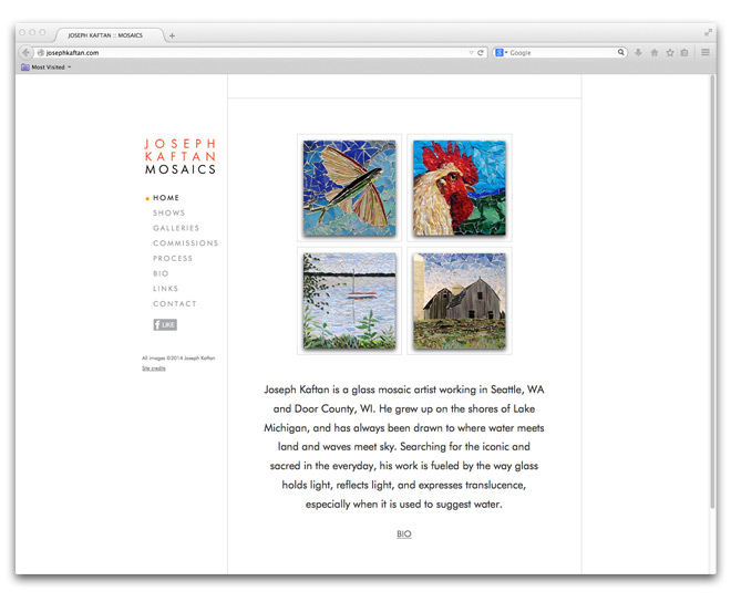
A prolific mosaic artist, Joseph Kaftan needed a site to display his diverse body of work. With so many pieces we decided to break the images into four categories and display them in scrolling galleries with the identity and navigation fixed on the left.
See the site here.
NEW WORK: Hagens Berman Banner Ad Campaign
Working in partnership with this class action law firm’s public relations agency, we conceived and designed a Google Ad Words banner ad campaign to attract whistleblowers from a number of different industries. The ads were created in a variety of sizes and will appear on various websites in response to specific keyword searches.
Continue reading “NEW WORK: Hagens Berman Banner Ad Campaign”
NEW WORK: Landau Associates Holiday Page
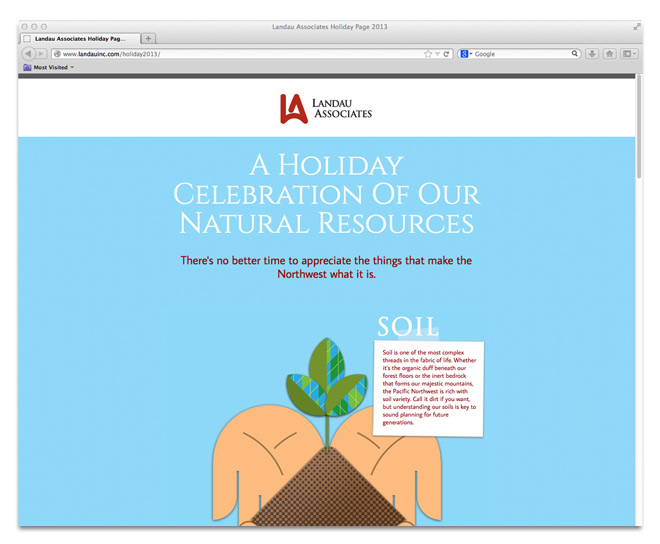
Landau Associates Environmental Engineers wanted a holiday page that expressed their good wishes to their clients and partners in a way that related to their work. We designed a page featuring illustrations of the natural resources that we all sometimes take for granted. The page is responsive and adapts to mobile devices.
See the page here.

