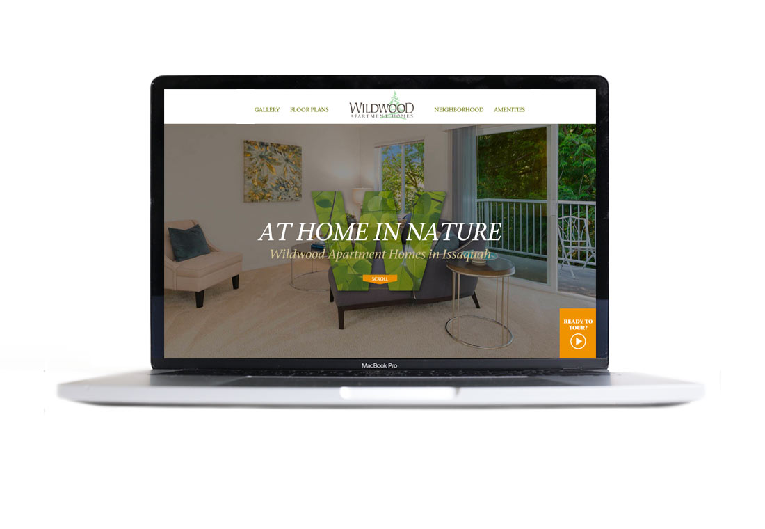
ROWLEY PROPERTIES
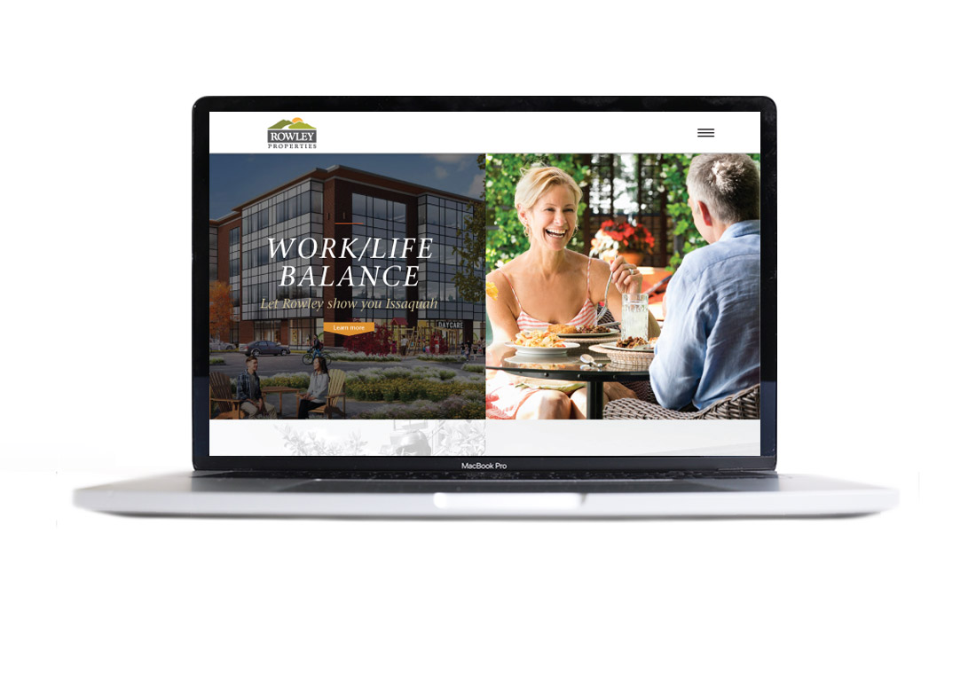
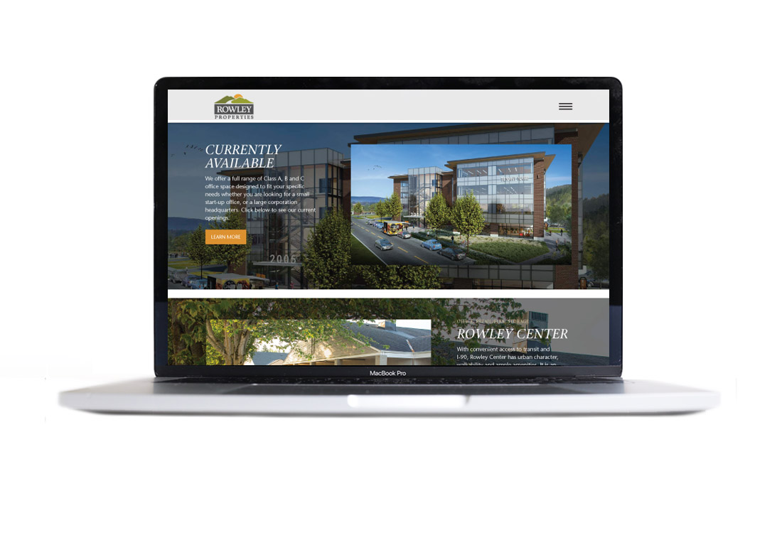
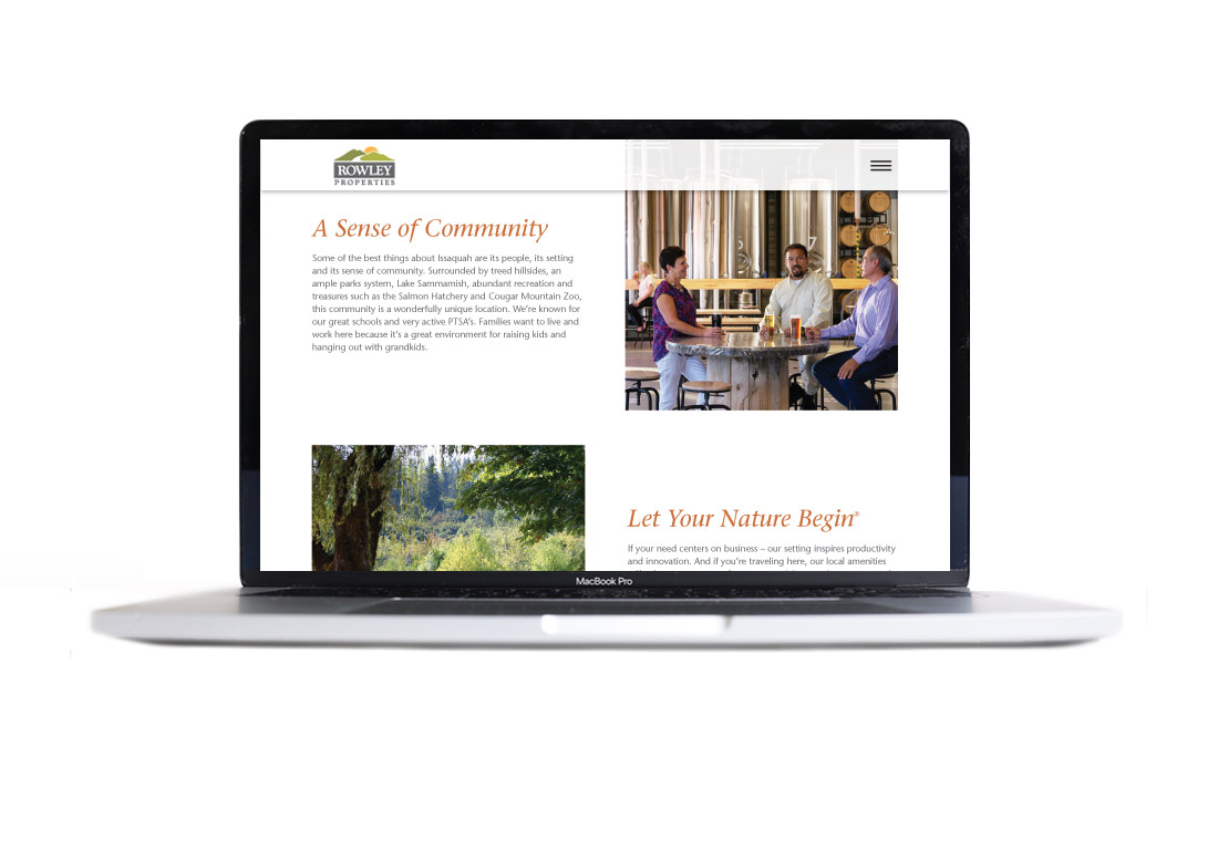
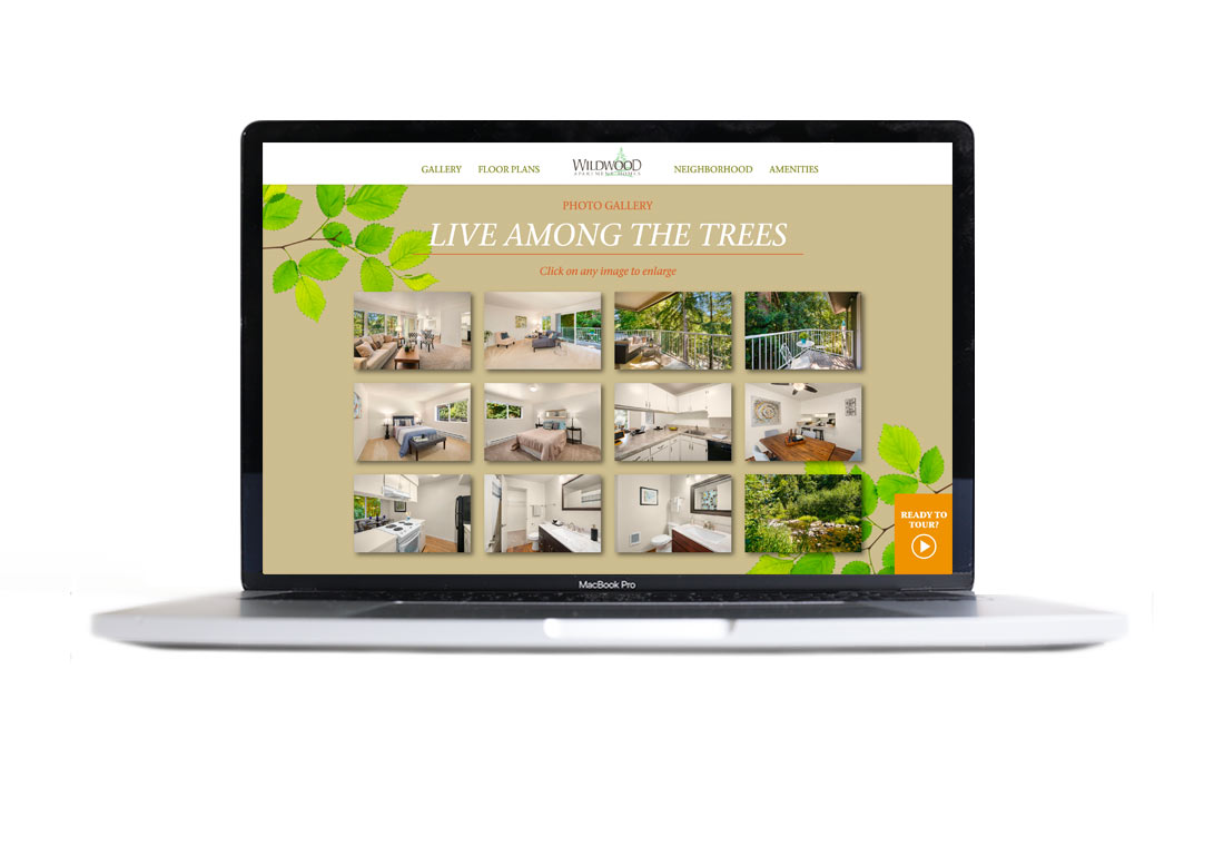
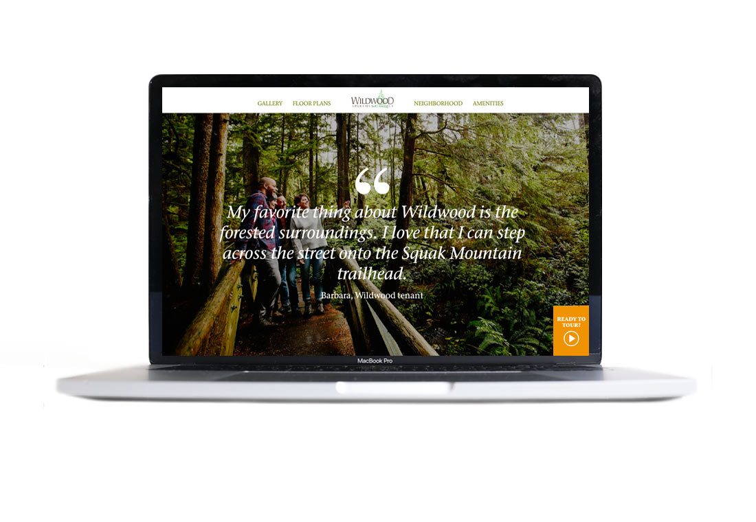
This Issaquah-focused, family-run property development and management company needed a refresh of their websites and identity. Rather than focusing entirely on the firm itself, we developed a strategy of selling Issaquah as a premium work/life destination, with Rowley as the host.
Since the company has had a long and successful history, as has their logo, we wanted to avoid creating a completely new statement with the identity and instead retained, but simplified and modernized, the mountains, a view synonymous with Issaquah and Rowley. Reducing the emphasis on the sunset puts more focus on the name itself.
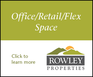
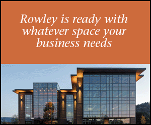
The banner ad campaign is an extension of our overall brand strategy with the goals being - 1: to address the misperception that Issaquah is 'too far out there'; 2: to reinforce the natural environment and work/life balance aspects that Issaquah offers; and 3: to make Rowley the go-to provider of commercial and residential space in Issaquah.